Bold Color Home Decor: A Complete Guide to Vibrant Interior Design
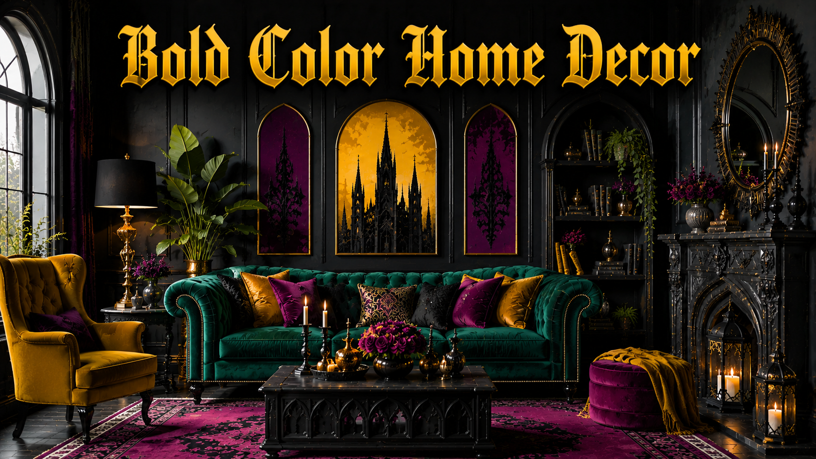
Bold color home decor is changing the way people think about interior design today. Instead of playing it safe with plain white or beige walls, more homeowners are choosing rich, vibrant shades that reflect their personality and energy.
This style is not just about paint, it is about creating a mood, a statement, and a space that feels alive. Whether it is a single accent wall or a fully colorful room, bold color home decor allows creativity to take center stage. This guide walks through everything you need to know before starting your own bold color journey at home.
What Is Bold Color Home Decor
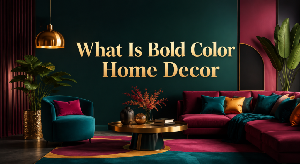
Bold color home decor simply means using strong, saturated colors instead of muted or neutral tones as the main design choice. It focuses on color as the hero of a room rather than just a background detail.
Definition and Core Idea
At its core, bold color home decor is about confidence in design choices. Instead of sticking to safe whites, grays, or beiges, homeowners choose deep, vivid colors like emerald green, cobalt blue, or burnt orange.
These colors are used on walls, furniture, or accessories to create a strong visual impact. The idea is to let color lead the design rather than support it quietly in the background.
Why It’s Trending Right Now
People today want their homes to feel personal and expressive rather than generic. Social media has also played a big role, showing colorful interiors that stand out compared to plain, minimal spaces.
As remote work and home-centered lifestyles grow, people spend more time indoors and want their surroundings to feel uplifting. Bold color home decor answers this need by turning ordinary rooms into energetic, memorable spaces.
The Psychology of Color in Home Design
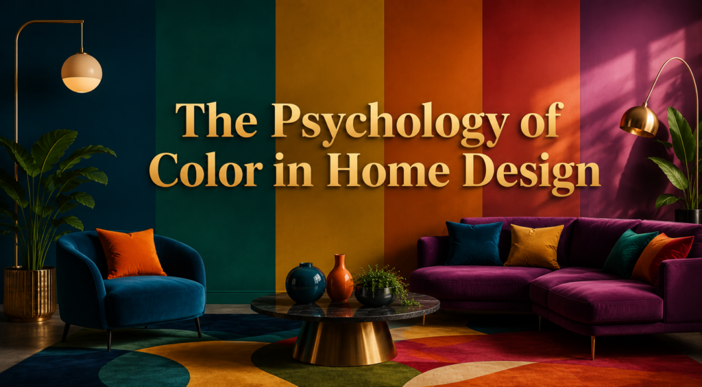
Colors do more than decorate a space, they influence how people feel and behave inside it. Understanding this psychology helps in choosing the right bold shades for each room.
How Colors Affect Mood and Energy
Different colors trigger different emotional responses in people. Red and orange tones can increase energy and appetite, which is why they work well in dining areas.
Blue and green shades tend to create calmness, making them suitable for bedrooms or reading corners. Yellow is often linked to happiness and optimism, adding warmth to living spaces. Choosing colors based on these emotional effects helps create a home that supports daily wellbeing.
Warm vs Cool Bold Tones
Warm bold tones include red, orange, and yellow, and they tend to make spaces feel cozy, active, and social. Cool bold tones like blue, green, and purple create a calmer, more relaxed atmosphere, often preferred in private spaces.
Mixing both warm and cool bold colors in one home can balance energy across different rooms. The key is matching the tone to the room’s purpose, not just personal preference.
Popular Bold Color Palettes
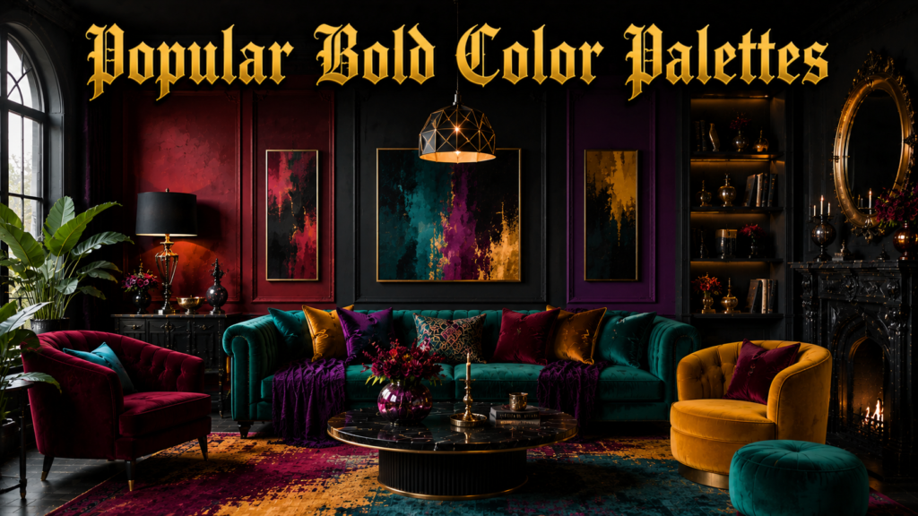
There are several popular color families used in bold color home decor, each offering a different personality and style. Below is a simple breakdown to help understand common palette options.
| Palette Type | Example Colors | Best Suited For |
| Jewel Tones | Emerald, sapphire, ruby red | Living rooms, dining areas |
| Earthy Bolds | Terracotta, mustard, olive green | Kitchens, entryways |
| Bright Pops | Hot pink, cobalt blue, tangerine | Kids’ rooms, home offices |
| Moody Darks | Deep plum, navy, forest green | Bedrooms, powder rooms |
Jewel Tones and Earthy Bolds
Jewel tones bring a luxurious and rich feeling to any room, often used in formal or elegant spaces. Earthy bold colors like terracotta and mustard bring warmth and a natural, grounded feel to interiors.
Both palettes work well with wooden furniture and natural textures, creating a balanced yet vibrant look. These tones are especially popular for people who want boldness without feeling too loud.
Bright Pops and Moody Darks
Bright pops of color like hot pink or cobalt blue are perfect for adding playful energy to a space. Moody dark bolds such as deep plum or navy create a dramatic, sophisticated atmosphere, especially in low-lit rooms.
Bright colors work best in smaller doses, like accent pieces, while moody darks can cover larger areas like accent walls. Together, these palettes show how bold color home decor can range from cheerful to elegant.
Room-by-Room Bold Color Ideas
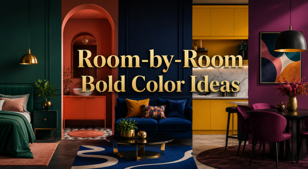
Every room in a home has a different purpose, which means bold color choices should be adjusted accordingly. Applying the right shade in the right space makes a huge difference in comfort and style.
Living Room and Bedroom
In the living room, a bold accent wall or a colorful sofa can instantly become the focal point of the space. Deep blues, greens, or warm terracotta tones work especially well here since they invite conversation and comfort.
In the bedroom, softer yet still bold tones like deep plum or navy create a relaxing but stylish environment. Adding colorful bedding or curtains is an easy way to introduce boldness without overwhelming the room.
Kitchen and Bathroom
Kitchens can handle bold colors well through cabinets, backsplashes, or even colorful countertops. Mustard yellow or deep green cabinetry can make a kitchen feel warm and inviting rather than plain and clinical.
Bathrooms, often overlooked, can use bold tiles or paint to turn a functional space into something visually exciting. Since bathrooms are usually smaller, even a small dose of bold color creates a strong effect.
Ways to Introduce Bold Color
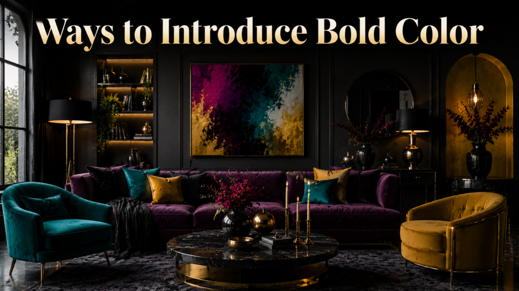
Bold color does not always mean repainting an entire house. There are several simple and flexible ways to bring boldness into any space gradually.
Walls Furniture and Textiles
Accent walls remain one of the easiest ways to introduce bold color without committing to an entire room. Statement furniture pieces, like a bright sofa or colorful armchair, can instantly transform a neutral space.
Textiles such as rugs, curtains, and cushions offer a low-commitment way to experiment with bold shades. These elements can easily be replaced or updated as trends and preferences change over time.
Art Cabinets and Accessories
Wall art and decorative accessories are another simple entry point into bold color home decor. A single bold painting or print can bring energy to an otherwise neutral room. Cabinets, especially in kitchens or bathrooms, offer a great surface for bold paint without affecting the entire room. Small accessories like vases, lamps, or ceramics allow for experimentation before making bigger commitments.
Color Combination Techniques
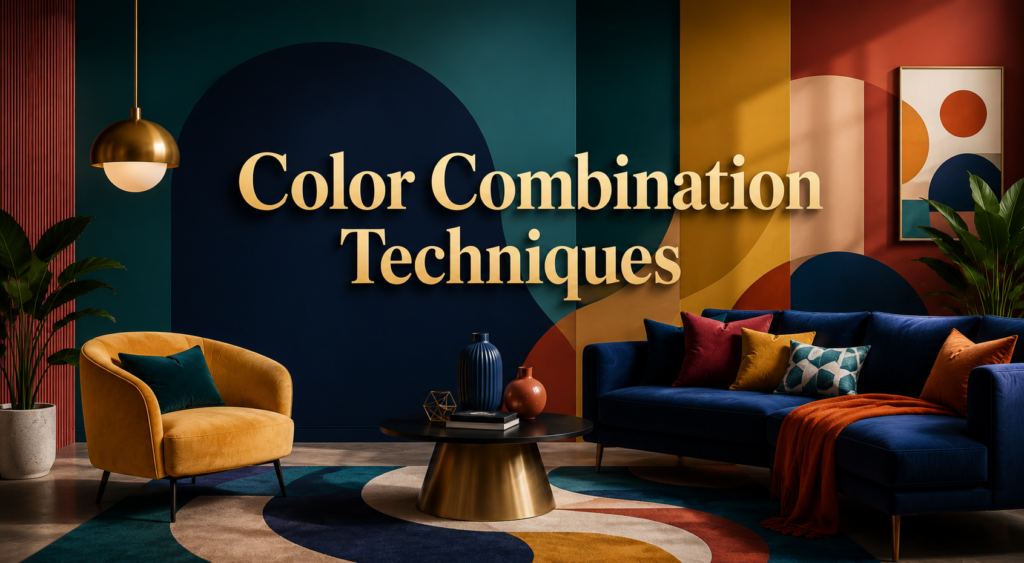
Combining bold colors correctly is what separates a well-designed space from a chaotic one. A few simple techniques can help balance boldness with harmony.
Complementary and Analogous Pairing
Complementary colors sit opposite each other on the color wheel, like blue and orange, creating strong contrast and visual interest. Analogous colors sit next to each other, such as blue, teal, and green, offering a smoother and more harmonious look. Both techniques help ensure that bold colors work together rather than clash. Choosing one approach as a guide makes color decisions easier and more consistent.
The 60-30-10 Rule
This classic design rule suggests using a dominant color for 60 percent of the room, a secondary color for 30 percent, and an accent color for the remaining 10 percent. Applying this rule with bold colors prevents a space from feeling overwhelming or unbalanced.
For example, a room could have a bold blue wall as the dominant shade, neutral furniture as secondary, and orange cushions as the accent. This structure gives boldness a clear and organized presence in the room.
Balancing Bold Colors with Neutrals
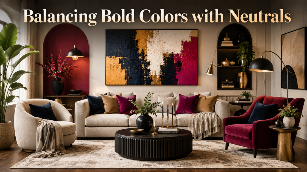
Neutrals play an important supporting role in bold color home decor, helping colors stand out without overpowering a space. This balance is often what makes bold interiors feel intentional rather than chaotic.
Using Neutrals as a Base
White, beige, and gray tones act as a calm foundation that allows bold colors to shine without competing for attention. Neutral flooring or ceilings give the eyes a place to rest amid vibrant walls or furniture. This contrast also helps bold colors appear more vivid and impactful. Many designers recommend starting with a neutral base before layering in bold accents.
Avoiding an Overwhelming Look
Too many bold colors in one space can create visual clutter and reduce the impact of the design. Limiting bold shades to one or two focal points helps maintain balance and sophistication. Using neutral furniture alongside bold walls or vice versa keeps the room feeling grounded. The goal is to let boldness feel like a deliberate design choice rather than an accident.
Common Mistakes and Budget-Friendly Tips

Even with good intentions, certain mistakes can make bold color decor look messy instead of stylish. At the same time, adding boldness does not have to be expensive.
Mistakes to Avoid
One common mistake is choosing too many bold colors without a clear plan or connecting theme. Poor lighting choices can also distort how bold colors appear, especially in rooms with limited natural light.
Ignoring the size of a room is another issue, since dark bold colors can make small spaces feel cramped. Testing colors in actual lighting conditions before committing helps avoid these common pitfalls.
Affordable Ways to Add Bold Color
Paint remains one of the most affordable ways to introduce bold color, especially for a single accent wall. Removable wallpaper is a great option for renters who still want a bold, temporary transformation.
Thrifted or DIY-painted furniture pieces can add boldness without a large budget. Small accessories like cushions, throws, or artwork offer an easy and inexpensive way to experiment with color.
Choosing the Right Bold Color for Your Home
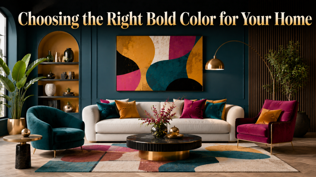
Selecting the perfect bold shade involves more than just personal taste. A few practical steps can help ensure the final choice works well long-term.
Testing and Lighting Considerations
Always test paint samples directly on the wall before making a final decision, since colors can look different depending on the surface. Natural light changes how a color appears throughout the day, so it is important to check samples in both morning and evening light. Artificial lighting, such as warm or cool bulbs, can also shift how bold colors are perceived. Taking time to test avoids costly mistakes later.
Matching with Existing Furniture
Bold colors should complement, not clash with, existing furniture and flooring. Considering undertones, such as warm wood tones versus cool gray flooring, helps in selecting compatible bold shades. It is also useful to think about whether the color choice will still feel relevant a few years down the line. Balancing personal style with practical compatibility ensures a more satisfying long-term result.
Conclusion
Bold color home decor offers a refreshing way to bring personality and energy into any home. From understanding color psychology to choosing the right palette for each room, small and thoughtful choices can create a big visual impact.
By balancing boldness with neutrals and following simple design rules, anyone can achieve a vibrant yet harmonious space. Starting small, testing colors, and staying consistent with a chosen palette are the best ways to begin this design journey confidently.
FAQs
Is bold color home decor suitable for small spaces?
Yes, but it works best when used in moderation, such as through accents or a single wall, rather than covering the entire room in dark bold shades.
Does bold color decor go out of style quickly?
Not necessarily, since classic palettes like jewel tones and earthy bolds tend to remain timeless when paired thoughtfully with neutrals.
What is the easiest way to start with bold color home decor?
Beginning with small elements like cushions, art, or a single accent wall is the easiest and most budget-friendly way to introduce boldness.
Can bold colors be used in every room of the house?
Yes, as long as the shade and intensity are matched appropriately to each room’s function and lighting conditions.
Related Articles
Western Home Decor: The Complete Guide to Rustic Ranch Style
Economy Home Decor: Simple Budget Ideas to Style Your Home
Gothic Home Decor: A Complete Guide to Dark, Dramatic Interior Design